Wolfram Data Repository
Immediate Computable Access to Curated Contributed Data
A dataset containing the prices and other attributes of almost 54,000 diamonds
| In[1]:= |
| Out[1]= | 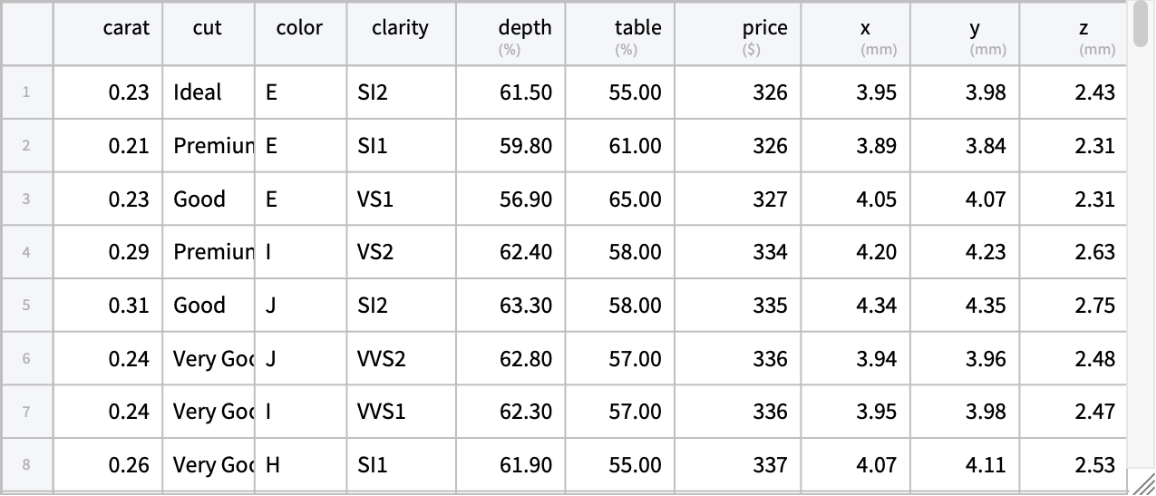 |
Dimensions:
| In[2]:= |
| Out[2]= |
Column keys and column descriptions:
| In[3]:= |
| Out[3]= |
| In[4]:= |
| Out[4]= | 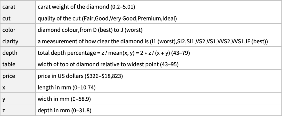 |
Column types:
| In[5]:= |
| Out[5]= |  |
Find the heaviest diamond in the data:
| In[6]:= |
| Out[6]= |  |
Find the most expensive diamond in the data:
| In[7]:= |
| Out[7]= | 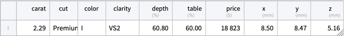 |
| In[8]:= | ![SortBy[AggregateRows[ResourceData[\!\(\*
TagBox["\"\<Sample Tabular Data: Diamonds\>\"",
#& ,
BoxID -> "ResourceTag-Sample Tabular Data: Diamonds-Input",
AutoDelete->True]\)], {"price" -> Function[Mean[#price/#carat]]}, "color"], "color"]](https://www.wolframcloud.com/obj/resourcesystem/images/1f9/1f9ef345-c18c-4df5-8e29-e0ec7836fe1f/7a43621e266196ee.png) |
| Out[8]= | 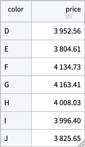 |
Compute the average price per carat in the data depending on all four 'C's - color, cut, clarity, and carat and sort by price:
| In[9]:= | ![ReverseSortBy[AggregateRows[ResourceData[\!\(\*
TagBox["\"\<Sample Tabular Data: Diamonds\>\"",
#& ,
BoxID -> "ResourceTag-Sample Tabular Data: Diamonds-Input",
AutoDelete->True]\)], {"price" -> Function[Mean[#price/#carat]]}, {"color", "cut", "clarity", "carat"}], "price"]](https://www.wolframcloud.com/obj/resourcesystem/images/1f9/1f9ef345-c18c-4df5-8e29-e0ec7836fe1f/70bd79be0abf7735.png) |
| Out[9]= | 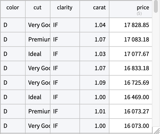 |
Create a pivot table for the average price per carat depending on color and clarity:
| In[10]:= | ![PivotTable[ResourceData[\!\(\*
TagBox["\"\<Sample Tabular Data: Diamonds\>\"",
#& ,
BoxID -> "ResourceTag-Sample Tabular Data: Diamonds-Input",
AutoDelete->True]\)], {"price" -> Function[Mean[#price/#carat]]}, {"clarity"}, {"color"}]](https://www.wolframcloud.com/obj/resourcesystem/images/1f9/1f9ef345-c18c-4df5-8e29-e0ec7836fe1f/3bae148b6cb92503.png) |
| Out[10]= | 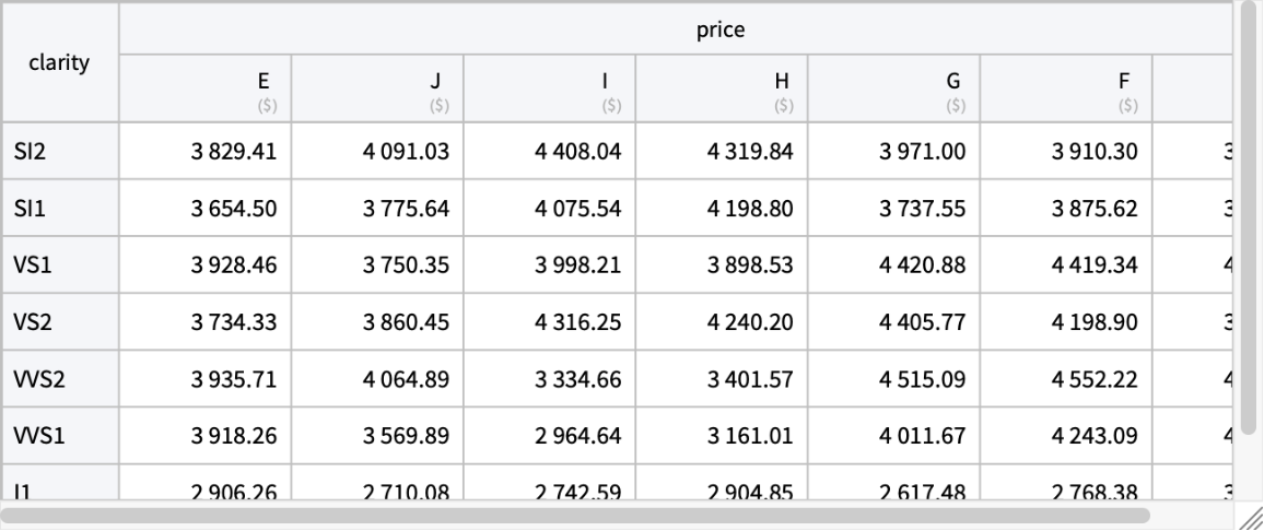 |
Visualize the price as a function of weight:
| In[11]:= | ![ListPlot[ResourceData[\!\(\*
TagBox["\"\<Sample Tabular Data: Diamonds\>\"",
#& ,
BoxID -> "ResourceTag-Sample Tabular Data: Diamonds-Input",
AutoDelete->True]\)] -> {"carat", "price"}, AxesLabel -> {"carat", "price"}]](https://www.wolframcloud.com/obj/resourcesystem/images/1f9/1f9ef345-c18c-4df5-8e29-e0ec7836fe1f/5307c8bfc055d7fe.png) |
| Out[11]= | 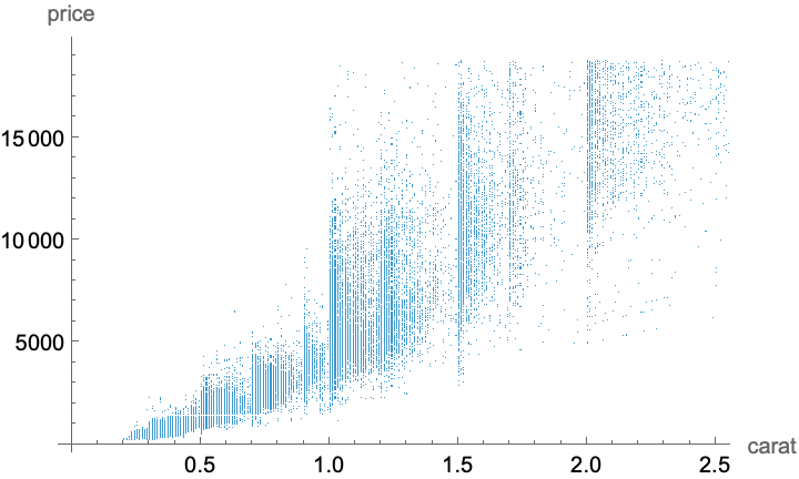 |
Assuming carat-price space, analyze the color distribution:
| In[12]:= |
| In[13]:= |
To make the plot more readable take a random sample from the data:
| In[14]:= |
| In[15]:= |
| In[16]:= |
The bounding rectangle for carat-price points:
| In[17]:= |
Create SpatialPointData object with "color" annotation:
| In[18]:= |
| Out[18]= | 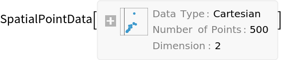 |
Use PointValuePlot to visualize the diamond colors across carat-price space:
| In[19]:= |
| Out[19]= | 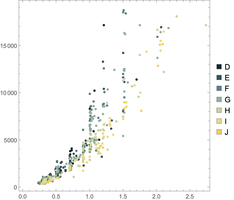 |
Gosia Konwerska, "Sample Tabular Data: Diamonds" from the Wolfram Data Repository (2025)